How do I even decide on a layout?
You want to stand out.
The best way to stand out is to be different to everyone else - right?
This is true in many walks of life, but when it comes to web shopping you need to be careful about being different.
There is a fine balance between creating something that is well designed and pleasing to use; and creating something so different that it is confusing to use and therefore has a negative impact on sales.
Conventions have already been created with web shops; we all expect to find certain features in certain places. All successful sites pay heed to this - yes even the biggest and most successful sites on the web. Read through the rest of this and then check some of the biggest names; you’ll see almost all of the following on all of them.
The answer here is to find a site with template layout options (a template is different to a design - you can still stand out with great design). These template options will help make sure that the site has the critical elements in the critical places.
10-point site checklist
Whether your site is Business to Consumer or Business to Business (or a combination) this 10-point site checklist should act as a great start when you search for a solution.
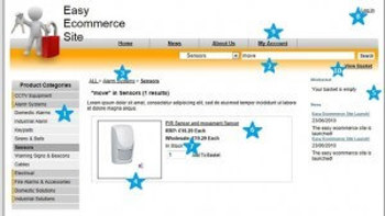
- Easy navigable categories on the left-hand side of the site. Make sure that the categories have an expanding tree structure for ease of use.
- Searching should have ultimate flexibility, allow searching of all products or categories; and match whole or part words.
- For an easy view, at the top of the page show a clickable breadcrumb trail, so that visitors can immediately back track if end up in the wrong place.
- On all search results show product details and pictures. With today’s internet, broadband speeds there is no good reason to not show images as early as possible.
- Always have a ‘mini basket’ visible. When a visitor choses a product they want confidence that it is stored in their basket whilst they browse further.
- Show pricing on the search results; visitors won’t buy if they don’t know the price! Don’t make them navigate further than they have to if they simply want to buy.
- Tell them whether it is available and allow them to add to their basket directly from the search results.
- Allow people to log into their account at any point - this is particularly vital for a Business to Business site. When a Business customer comes to your site they will perhaps want to be able to buy on their account. They will certainly want to be offered their agreed pricing on products that they buy regularly. The other unseen issue here is that without true integration to your back-office accounting system you won’t be able to reliably offer these elements.
- If I log in, I want to see my history, track the progress of my order, or re-buy items that I have bought before. So, provide a ‘My Account’ area with all of these key items.
- In the checkout process allow for delivery options (both charges and addresses) and show the customer progress through the checkout process with clear graphics that tell them how many steps and what they are. Allow for buying on account for customers that have accounts, or paying by card for those that don’t.
The where and the why...
The layout shown here follows the entire internet shopping ‘friendly’ conventions... for good reason.
Here is just one example of why:
Categories on the left and available in the search drop down - that much is perhaps obvious.
However, did you know that in order to maximise sales through your category structure there is a science to the order?
Your first (top of the list) category should be your No.1 most popular category.
Then, your last (bottom of the list) category should be your 2nd most popular category
Second from the top should be your 3rd most popular
Second from the bottom should be your 4th most popular
etc. until you meet in the middle with the least popular
This is the way that people look at lists and will maximise visits and therefore sales - however, try and avoid having more than 12 categories visible remember use an expanding tree structure to ease the visual navigating experience of multiple categories.
There are many more conventions like this with eCommerce sites, follow this series to maximise your online profits.
